|
Journal of Urban Design and Mental Health 2017;3:3
|
EDITORIAL
Mapping towards a Good City Life
Daniele Quercia (1), Luca Maria Aiello (1), Rossano Schifanella (2)
(1) Bell Labs, UK
(2) University of Turin, Italy
(1) Bell Labs, UK
(2) University of Turin, Italy
What makes for a good city street? Some urban planners would say the “fabric”: the collection of streets, blocks and buildings. In “Great Streets”, the urbanist Alan Jacobs compared the layout of more than 40 world cities, and found that good streets tend to have narrow lanes (making them safe from moving cars), small blocks (making them comfortable), and architecturally-rich buildings (making them interesting).
In the future, streets will be increasingly augmented with new monitoring technologies that promise to allocate urban resources (e.g., electricity, clean water, car traffic) more efficiently and, as such, make these streets ‘smarter’. The corporate smart-city rhetoric is about efficiency, predictability, and security. "You’ll get to work on time; no queue when you go shopping, and you are safe because of CCTV cameras around you". Well, all these things make a city acceptable, but they don’t make it great.
Good street design is important, but what matters most is people’s wellbeing. In the last few years, we have worked on projects that offer a counterpoint to the dominant efficiency-driven narrative of the smart cities movement. These projects have focused on understanding how people psychologically experience the city. To foster and maintain momentum, we launched a new initiative called goodcitylife.org. This is a global network of researchers and practitioners who tackle fundamental urban problems that have hitherto received little attention and that would not necessarily make cities smarter but would definitely make dwellers happier.
Our initial projects considered hypotheses put forward in the 1970s urban sociology literature from commentators, researchers and practitioners such as Jane Jacobs, Stanley Milgram, and Kevin Lynch, and for the first time, we have been able to test these hypotheses at scale. With that line of research, we had the ambitious goal of capturing the psychology of city living at scale. To begin with, we explored the concept of psychological maps.
Psychological Maps
A geographic map of a city consists of streets and buildings and reflects an objective representation. A psychological map, instead, is a subjective representation that dwellers carry around in their heads. Tourists in a strange city start with few reference points (e.g., hotels, main streets) and then expand the representation in their minds; in short, they slowly begin to build a picture. To see how these subjective representations matter, consider that, starting from Kevin Lynch’s seminal book The Image of the City (1960), studies have posited that good imaginability allows city dwellers to feel at home and increase their community wellbeing. People generally feel at home in cities whose neighbourhoods are recognizable. Comfort resulting from little effort, the argument goes, would impact the individual and ultimately collective well-being. A case in point is in a large city such as London. Every Londoner has had long attachment to some parts of the city, which brings to mind a flood of associations. Over the years, London has been built and maintained in a way that it is imaginable, i.e., that mental maps of the city are clear and economical of mental effort.
Kevin Lynch was one of the first to work formally on these kinds of perception and he created a psychological map of Boston by interviewing Bostonians. Based on hand-drawn maps of what the participants’ ‘versions of Boston’ looked like, he found that a few central areas were known to almost all Bostonians, while vast parts of the city were unknown to its dwellers. More than 10 years later, Stanley Milgram repeated the same experiment and did so in a variety of other cities, including Paris and New York.
However, the problem with hand-drawn maps is that capturing them takes time, and it is not clear how to aggregate the variety of unique map configurations. One way of fixing this problem is to place a number of constraints on the participants when externalizing their maps. In this vein, Milgram constrained the experiment by reducing it to a simple question: ‘If an individual is placed at random at a point in the city, how likely is he (or she) to know where he is?’. The idea is that one can measure the relative ‘imaginability’ of cities by finding the proportion of residents who recognize sampled geographic points. That simply translates into showing participants scenes of their city and testing whether they can recognize where the scenes are located. Milgram did setup and successfully run such an experiment in various lecture theatres. Each participant usually spent 90 minutes on the task, and he collected responses from as many as 200 participants for New York City.
Since then, such an experimental setup has rarely been replicated. A few years ago, we did so but in the form of a web game. Our crowdsourcing web (available at urbanopticon.org) picks up random locations from Google Street View and tests users to see if they can determine in which subway location (or borough or region) the scene is. In less than five months, we collected data from 2,255 users (Quercia, 2013).
By analysing the recognizability of the five London regions, we found that the general conclusions drawn by Milgram for New York hold for London with impressive consistency, adding external validity to our study. Central London was the most recognizable region (about two and a half as many correct placements as for the others) while South London had little cognitive coverage.
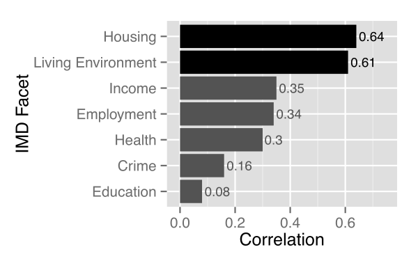
With our data we were then able to show quantitatively the extent to which the typical Londoners’ collective psychological map tallies with the socio-economic indicators. By correlating the fraction of correct answers in a borough with the borough’s eight socio-economic indicators, we saw that recognizable boroughs enjoyed better housing and living environments, and higher incomes (Figure 1).
Figure 1: Correlation between recognizability and deprivation for London Boroughs.
Given the importance of psychological maps, one might wonder how these maps are generated in the first place. The main input channels for an individual are, of course, the senses. Therefore, as next step, we explored the possibility of mapping the sensorial and emotional layers of cities. We decided to test whether digital data was of any use for such a task. That is reasonable to hypothesize because part of a street’s vitality is, nowadays, captured in the digital layer: street dwellers take pictures and post them on Flickr, and, when they visit places, they share their whereabouts on Foursquare. It is therefore reasonable to assume that, from digital footprints, one could derive good proxies for the different ways people perceive streets.
Happy Maps
The first sense we explored was sight, and we did so with Google Street Views. Our research question was “Which urban scenes people tend to find visually pleasurable?”. To partly answer that question, we built a web game with collaborators at the University of Cambridge (available at urbangems.org) in which users are shown ten pairs of urban scenes of London and, for each pair, a user needs to choose which one they consider to be most beautiful, quiet, and happy. Based on user votes, we were able to rank all urban scenes according to these three attributes (Quercia, 2014a).
We then analyzed the rated scenes using image processing tools. We discovered that the amount of greenery in any given scene is associated with all the three attributes and that cars and fortress-like buildings are associated with sadness (we equated sadness to our measurement for the low end of our ‘spectrum’ of happiness). In contrast, public gardens and Victorian and red brick houses are associated with happiness. Our results all point in the same direction: urban elements that hinder social interactions are undesirable, while elements that increase interactions are the ones that should be integrated by urban planners to retrofit our cities for happiness.
We then applied these findings into a new mapping tool (Quercia, 2014b). Existing mapping technologies return shortest directions. To complement them, we designed a new tool that returns directions that are not only short but also tend to make urban walkers happy.
Smelly Maps
The second sense we explored was smell. Think about your nose. It is a big data machine. Humans are able to potentially discriminate thousands of different odors. Yet, city officials and urban planners are able to deal with only a few odors out of thousands. Why this negative and oversimplified perspective? Smell is simply hard to measure.
City officials entirely rely on complaints to capture smell and ultimately inform urban planning. In the research world, smell has been recorded in a variety of ways: with ‘nose trumpets’ that capture four main olfactory aspects (i.e., odor character, odor intensity, and duration); with web maps that elicit smell words from users in a crowdsourcing way; and with sensory walks in which groups of people are asked to walk around the city and record what they smell. Unfortunately, those ways of collecting smell information require substantial public engagement to be effective.
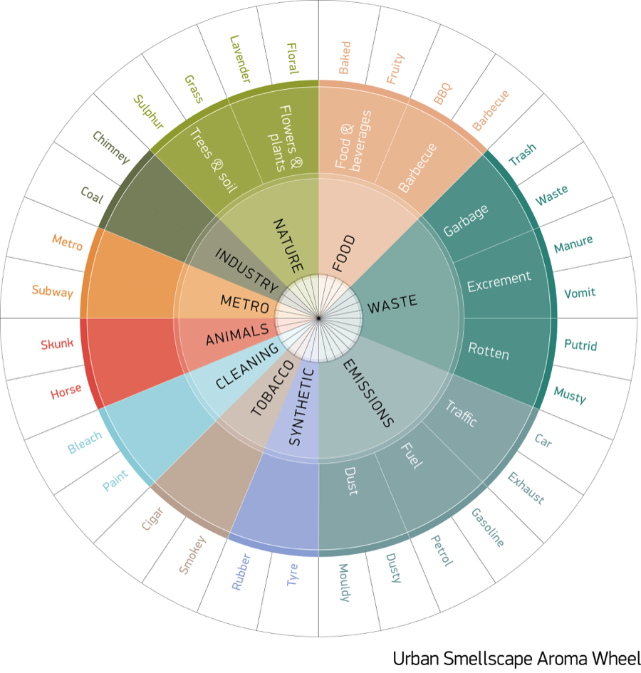
We therefore proposed a new way of capturing smell from data implicitly generated by social media users (Quercia, 2015). The idea is to search for smell-related words on geo-referenced social media content. To compile a list of such words, we ventured out in the urban world and conducted “smellwalks” around seven cities in UK, Europe, and USA. Locals were asked to walk around their city, identify distinct odors, and take notes. Smell descriptors were taken verbatim from the smell walkers’ original hand-written notes. As a result of those sensory walks, smell-related words were recorded and classified, resulting in the first urban smell dictionary (depicted as a wheel in Figure 2), which we made publicly available to the research community at http://goodcitylife.org/data.
Figure 2. Wheel reflecting our urban smell dictionary
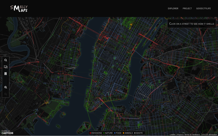
For the cities of Barcelona and London, we then collected geo-referenced tags from Flickr pictures. We matched those tags with the words in the smell dictionary. We found that smell-related words are best classified in ten categories. Our classification, generated automatically from social media, is very similar to classification systems obtained manually as a result of field research. We also found that specific categories (e.g., industry, transport, cleaning) correlated with governmental air quality indicators, and that speaks to the validity of our study. Finally, we showed that, using social media data, we were able to capture not only a city’s dominant smells (base smell notes) but also localized ones (mid-level smell notes). Maps for more than twelve world-class cities are available on http://goodcitylife.org/smellymaps and that of New York City is shown in Figure 3.
Figure 3: Urban Smellscape of New York City
Chatty Maps
The final sense we worked on was that of hearing. Urban sound has a huge influence over how we perceive places. Urban planners and city officials have mostly focused on the negative side of urban sounds, giving little attention to pleasant sounds. Yet, positive sounds have been shown to positively impact city dwellers’ health.
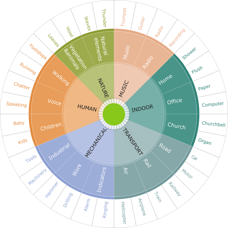
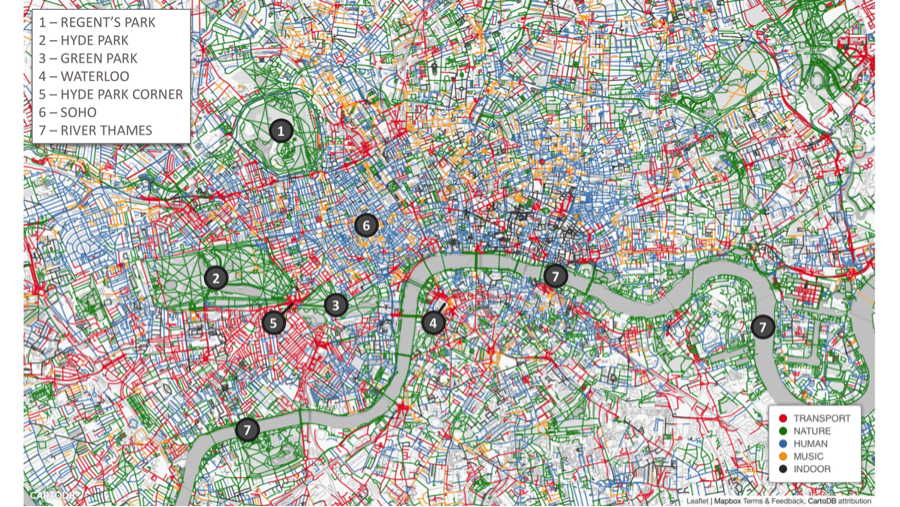
That is why we proposed a new way of capturing the whole spectrum of urban sounds at scale by combining social media data with a crowdsourcing repository (Aiello, 2016). First, we collected sound-related words from Freesound, which is the largest public online collaborative repository of audio samples. We then collected geo-references pictures tagged with those words. To categorize sounds into coherent categories (e.g., talking and laughing), we counted the number of co-occurrences of those words in a large photo corpus from Flickr, with the hypothesis that if two words often co-occur they belong to the same category. With this assumption, we run an algorithm to automatically detect clusters of words often occurring together, and we produced the first urban sound dictionary (Figure 4). In it, sound words are classified into six main categories: transport (e.g., motorcycle, locomotive, aircraft, engine), nature & animals (e.g., chirp, barking, raining), human (e.g., footsteps, talking, sneezing, laughing), music (e.g., guitar, flute, cello), mechanical (e.g., jackhammer, compressor), and indoor (e.g., showering, toilet flushing).
Figure 4. Wheel reflecting urban sound dictionary
In a way similar to the Smelly Maps project, for a variety of cities around the world, we extracted the tags of geo-referenced pictures from Flickr and associated them with each street segment to compute a sound profile of the segment. That resulted in interactive maps for 12 cities (London, Barcelona, Madrid, New York, Boston, Chicago, Washington, Miami, San Francisco, Seattle, Milan, Rome), one of which is shown in Figure 5, and all of them are available in an interactive form at http://goodcitylife.org/chattymaps.
Figure 5. Urban Soundscape of London
We then looked at emotion-related picture tags and found that human-related sounds (e.g., talking, sneezing, laughing, screaming) tended to be associated with picture tags reflecting joy or surprise. Musical instruments (e.g., guitar, flute, cello) were associated with joy, sadness, or both (melancholy). Traffic and mechanical sounds (e.g., motorcycle, locomotive, aircraft, engine, jackhammer, compressor) were associated with anger or fear. Finally, sounds coming from households (e.g., showering, toilet flushing) or places of worship (e.g., bells, organ) were associated with trust.
Urban sound can also be soothing, exhilarating, saddening, and surprising. Using a statistical analysis of people's reactions to different sorts of urban sound, we drew up four broad categories: chaotic, calm, monotonous and vibrant. Parks sound calm and, interestingly, beaches (at least, those in Barcelona) are characterized by monotonous sounds, which is not that bad after all.
Conclusion
In light of an increasingly urbanized future, technology companies are rushing to instrument cities with sensors and actuators, with the promise of making our lives easier. With the latest technologies, cites will exhibit smartness in how they are designed, developed and run, the argument goes. We believe, instead, that the future of the city should be, first and foremost, about people, and people are nowadays increasingly networked. A creative use of network-generated data can tackle hitherto unanswered research questions and offer new ways of capturing sensory and psychological perceptions at scale. The goal of our work has been to make visible what is normally not and, ultimately, to make it possible to create more fulfilling, humanistic, and sustainable urban environments.
RETURN TO TABLE OF CONTENTS
References
Quercia, D., Pesce, J.P., Almeida, V. and Crowcroft, J. (2013) Psychological Maps 2.0: A web engagement enterprise starting in London. In Proceedings of ACM Conference on World Wide Web (WWW), 22, pp. 1065-1076.
Quercia, D., Ohare, N. and Cramer, H. (2014a) Aesthetic Capital: What Makes London Look Beautiful, Quiet, and Happy? Proceedings of ACM Conference on Computer Supported Cooperative Work and Social Computing, 17, pp. 945-955.
Quercia, D., Schifanella, R. and Aiello, L.M. (2014b) The Shortest Path to Happiness: Recommending Beautiful, Quiet, and Happy Routes in the City. ACM Conference on Hypertext and Social Media, 25, pp. 116-125.
Quercia, D., Schifanella, R., Aiello, L.M., McLean, K. (2015) Smelly Maps: The Digital Life of Urban Smellscapes. AAAI Conference on Weblogs and Social Media, 7.
Quercia, D., Aiello, L.M., Schifanella, R. (2016) The Emotional and Chromatic Layers of Urban Smells. AAAI Conference on Weblogs and Social Media.
Aiello, L. M., Schifanella, R., Quercia, D., Aletta, F. (2016) Chatty maps: constructing sound maps of urban areas from social media data. Royal Society Open Science.
About the Authors
|
Daniele Quercia leads the Social Dynamics group at Bell Labs in Cambridge (UK). He has been named one of Fortune magazine's 2014 Data All-Stars, and spoke about “happy maps” at TED. His research has been focusing in the area of urban informatics and received best paper awards from Ubicomp 2014 and from ICWSM 2015, and an honourable mention from ICWSM 2013. He was Research Scientist at Yahoo Labs, a Horizon senior researcher at the University of Cambridge, and Postdoctoral Associate at the department of Urban Studies and Planning at MIT. He received his PhD from UC London. His thesis was sponsored by Microsoft Research and was nominated for BCS Best British PhD dissertation in Computer Science. Web: researchswinger.org
Twitter: @danielequercia |
|
Luca Maria Aiello is a Senior Research Scientist in the Social Dynamics group at Bell Labs in Cambridge, UK and Research Fellow of the ISI Foundation in Torino, Italy. He received his PhD in Computer Science from the University of Torino in 2012 and he has been a Research Scientist at Yahoo Labs for almost 5 years. He conducts interdisciplinary research in computational social science, network science, and urban informatics. He co-authored 50+ peer-reviewed papers and his work has been covered by more than 200 news articles published by prestigious news outlets worldwide including Wired, Wall Street Journal, and BBC. He was General Chair of SocInfo in 2014 and covered different organizational roles in ICWSM, ACM Hypertext, ACM Multimedia, UMAP. He is among the founding members of GoodCityLife.org.
Twitter: @lajello |
|
Rossano Schifanella is an Assistant Professor in computer science at the University of Turin, a Visiting Scientist at Nokia Bell Labs, and a former Visiting Scientist at Yahoo Labs and at Indiana University School of Informatics and Computing. His research embraces the creative energy of a range of disciplines across technology, computational social science, data visualization, and urban informatics. He is interested in computational methods to investigate social phenomena, aesthetics and creativity in media platforms, and figurative language. He is also passionate about building mapping tools that capture the sensorial layers of a city and designing innovative methods to explore urban spaces. He is among the founding members of GoodCityLife.org.
Twitter: @rschifan |
RETURN TO TABLE OF CONTENTS
